Hand Lettering Basics
In this post, you’ll learn the basics of hand lettering so you can create your own hand-lettered piece even if you’ve never lettered before!
But first, let’s talk about what hand lettering is and why it’s important. Hand lettering is an illustration style where letters are drawn by hand and it’s one of my favorite forms of artistic expression.
When life gets hard, sometimes the best tool I have to work through my feelings is art. This is why I love lettering so much. It allows me to express myself and share messages of hope, resilience, and power in a beautiful way. I use hand-lettered quotes in my portfolio to empower and inspire and in this blog post, I’ll share how you can get started with your own inspiring hand-lettered piece!
One of the most common misconceptions about hand lettering is that you need to have good handwriting to be a good hand lettering artist. And that’s simply not the case! My hand-lettered pieces look nothing like my actual handwriting! The key is to think of the letters not as something you write, but as something you draw.
This is an important distinction because drawing something brings more intentionality to your piece and will give it that unique hand-lettered look. It’s important to remember that drawing letters is a learned skill. Anyone can learn to letter! So don’t let your handwriting limit you from trying your hand at lettering!
Here’s an example of one of my pieces in its beginning stages. Just like any illustration composition, I sketched it out first before illustrating the final piece.


Now let’s dive into learning more about hand-lettering!
Supplies/Media
You don’t need any special supplies to hand-letter. You can create beautiful lettering with just a ballpoint pen and white paper if that’s what you have on hand. I actually recommend starting simple if you’re new to lettering. Working with a monoline pen (which can be simple as a ballpoint pen) to get the basics down before using more complicated media like brush pens and paint is a great place to start.
I’ve used all kinds of media for my hand lettering projects including gouache, watercolor, brush pens, Procreate, and Photoshop! So feel free to use whatever you’re most comfortable with.
Gathering Inspiration
The first step towards creating your hand-lettered illustration is to gather inspiration! I keep a running list of my favorite quotes in the notes app on my phone, so when I’m feeling inspired to create a hand-lettered piece I have lots of ideas to pull from.
Choose a quote or phrase that’s meaningful to you for your hand-lettered project. If you’re new to lettering I’d recommend keeping it short because longer quotes can become difficult to arrange in a legible composition.
You’ll also want to decide on the style of lettering that you’re going for. The majority of my hand lettering leans towards a more vintage style like this.


But I also love to play with other styles like these. Can you tell how the following examples differ from the vintage styles above?

Check out my Lettering & Quotes Pinterest Board to see more of my own lettering and the lettering that inspires me! Then create your own board that you can refer to for inspiration as you create your lettering piece.
Different Styles of Lettering
Now let’s take a look at the different styles of lettering. We’ll look at the three main types of letters – serifs, sans-serifs, and script letters. These are all present in this quote example. Let me break it down and show you which is which!
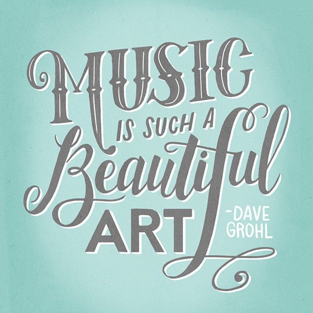
Serif
A serif letter is one that has a little extra stroke at the end of the letterform. In this example, the word “Music” is using a serif font. The extra lines at the end of each letter are the serifs! The “M” has some flourishes on a few parts of the letter, but it's still categorized as a serif font since it includes the same serifs on the bottom left and top right as the other letters do.

Sans-serif
A sans-serif letter is simply a letter that doesn’t have a serif! Think block letters or the Arial font on your computer. The clearest example of a sans-serif letterform in this example is the word “Art.” But “is such a” and “Dave Grohl” also utilize sans-serif letters. This just goes to show how much variation you can have within the same type of letterform!

Script
The last type of letterform (and my personal favorite!) is script lettering. This type of hand-lettering is what you might think of as cursive or calligraphy. It’s a style of lettering where each letter connects and flows together. In this example, the word “Beautiful” is drawn in a script style.

One of the key indicators of a script font is that it utilizes heavy downstrokes and light upstrokes. The downstrokes are any parts of the letter that you create with a downward motion if you were writing the letter out on paper.
Look at the “L” in beautiful. Notice how the curved part of the “L” that loops up is thin, while the main part of the letter (the downstroke) is bigger, and then the final tail of the “L” is thin again since it’s moving in an upward direction. Practicing lettering with thin upstrokes and heavy downstrokes is one of the keys to making your lettering look professional!

Now that you know the different types of letterforms, you’ll be able to identify them in your inspiration photos. For practice (and only for practice!) you can sketch some of the letters or words that you pinned as inspiration. Then use what you learn and apply that skill to your own unique composition!
Consistency of Letterforms
Another important note about lettering is that you want to try and keep the letterforms consistent. Aim for consistency in the following areas:
The spacing between your letters
The size of the letters
The style of the letters
The angle of the letters
In this example, the word “Follow” shows consistency in the angle of the letters and the spacing. “Your” has consistency in the size of the letters, and each word stays consistent with its own style.

That said, sometimes we learn the rules to break the rules. You’ll notice in this composition that the word “Curiosity” breaks some of the rules of consistency since it utilizes different-sized letters.
The key is to make sure that there are elements that unite the piece like the style you chose, the color palette, the consistency of the composition, or any illustrations you include. In this example, “Curiosity” fits in line with “Follow” and I tucked Elizabeth Gilbert’s attribution neatly into the empty space under the word. This makes the composition look cohesive since it fits into a nice little box inside the canvas.

Brush Lettering
When people think of hand lettering they often think of brush lettering first. Brush lettering is a style of hand lettering where you utilize a brush pen or paintbrush to create the thick downstrokes we talked about earlier.
I use primarily use brush lettering in my books. Here are a few examples of what that looks like!

There are lots of different tools out there that you can use to create a brush-lettered look, but my favorite is to simply use a brush pen like this one! The key is to use heavy pressure when you’re creating the downstroke and lighten the pressure as you go up.
And there you have it! A crash course in hand lettering. There’s so much that goes into lettering, and we just scratched the surface in this post! I hope that this empowered you with the knowledge that hand lettering is a learned skill. If it’s something you want to pursue, there is no reason you can’t make it happen!
Decide that you want to learn, let go of perfection, and then start practicing! I’d love to see your hand-lettered artwork. Share what you make on Instagram with the hashtag #ArtWithAnnDanger so I can cheer you on!