Color Theory: Painting a Custom Color Wheel in Gouache
Want to learn color theory in a fun and explorative way? This post will walk you through creating a basic color wheel with a twist. You’ll learn the color theory fundamentals while also breaking from the traditional primary colors to create your own unique color palette.
Sometimes color can feel intimidating when you’re just starting out, so I want to teach you everything you need to know to elevate your artwork in a fun and approachable way. Whether you’re a hobbyist, beginner, or experienced artist, this tutorial will help you find your creative style and create a signature color palette while learning the fundamentals of color theory.
By the end of this tutorial, you’ll know the fundamentals of color theory, how to discover your personal color style through a custom color wheel, and tips for picking great color palettes!
Why Learning Color is Important
Colors evoke feelings. They set the mood of a piece and can help dictate the emotion you’re trying to convey with your work. Learning to work with color in an intentional way can take your artwork from good to great.
New artists tend to gravitate towards using every color of the rainbow in their pieces when they’re starting out. I did this too! When I was in art school, one of my first critiques came from a professor who looked at my piece and said “Good start, but you don’t have to use every single color in every piece.” Mind blown! I thought I was “good with color” and I realized that there’s a difference between being colorful and being skillful with color. I learned that limiting my color palettes made my work look much more professional.
By learning the fundamentals of color theory you’ll be able to start making more intentional color choices that will elevate your artwork instantly! So let’s dive in.
Color Theory Basics
Now, I know what you might be thinking… “Here comes the boring part!” But I promise that color theory doesn’t have to be stuffy or confusing. Once you get the basics down, you’ll immediately start to see examples of it in real life and use what you learn to make significant changes in your artwork. Here are the most basic concepts of color theory that will help you get started!
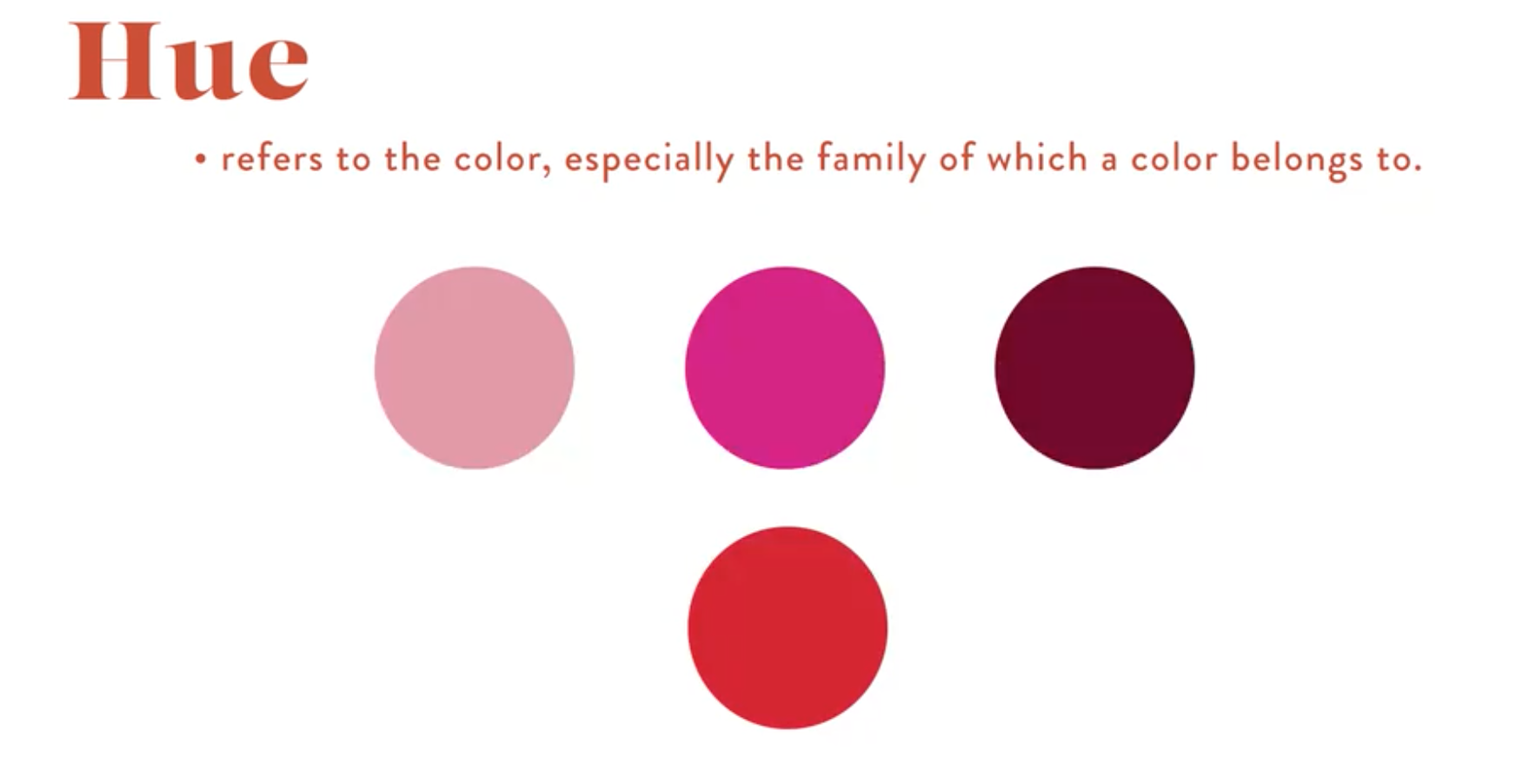
Hue
Hue refers to the color family that a specific color belongs to. For example, burgundy, magenta, and rose all belong to the red family.
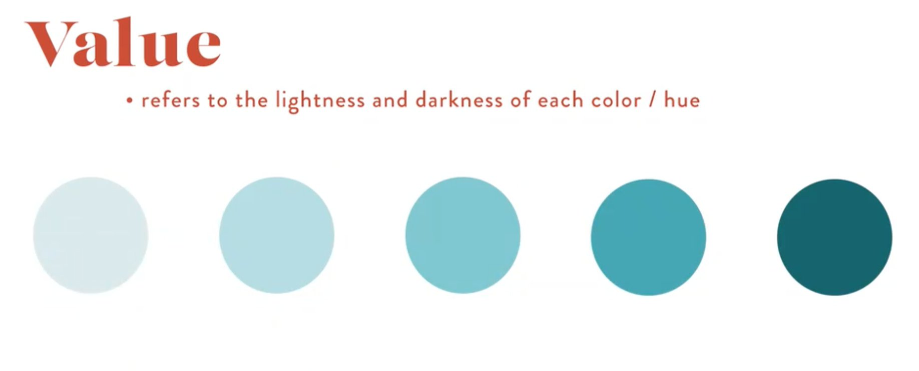
Value
Value refers to the lightness or darkness of a color. For example, the colors below are all turquoise, but with varying values.
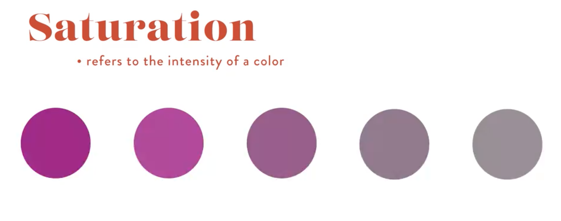
Saturation
Saturation refers to the intensity of a color. As you remove saturation, colors become more muted and gray. Saturation can be used to draw attention in your artwork as our eyes are naturally drawn to more saturated colors. You can use this to guide the viewers’ eye to the most important parts of your artwork.
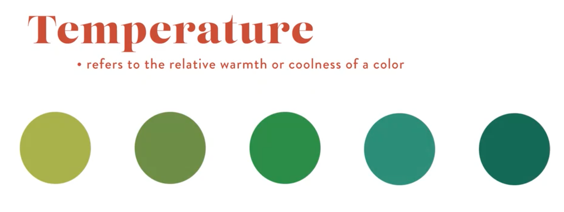
Temperature
Temperature refers to the coolness or warmth of a color. Warmer colors have more yellow in them like olive green or lime green. Cooler tones have more blue. The colors on the left of the example below are warmer, and the colors on the right and cooler.
As a general rule, warmer things look closer to us and cooler things look further away. Learning how to use temperature can help you create a sense of perspective in your artwork by painting things that are further away in cooler colors.
Primary Colors
Chances are, you’re already familiar with the three primary colors – red, yellow, and blue. Any color of the rainbow can be created by mixing combinations of the primary colors. This is exactly what we’ll do in the next section when you make your color wheel!
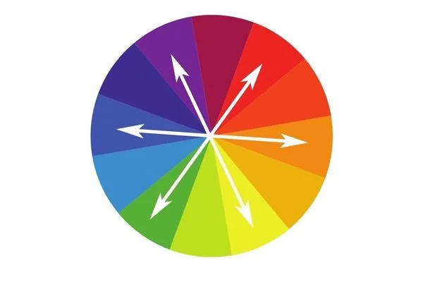
Complementary Colors
Complementary colors are colors that are opposite each other on the color wheel. These colors bring out the best in each other. When you put them next to each other, it makes each one look brighter and provides a visually appealing contrast that makes any piece shine.
Some examples of complementary colors are red and green, blue and orange, and violet and yellow. You’ll notice these as we build out a color wheel next.
Painting Your Custom Color Wheel
Now it’s time for the fun part! Creating your personal color wheel! This is one of my favorite ways to teach students to discover their unique style. Color wheels show us how colors exist in relationship to each other, and they’re a great tool for exploring how colors work together beyond the standard primary colors that we’re all familiar with.
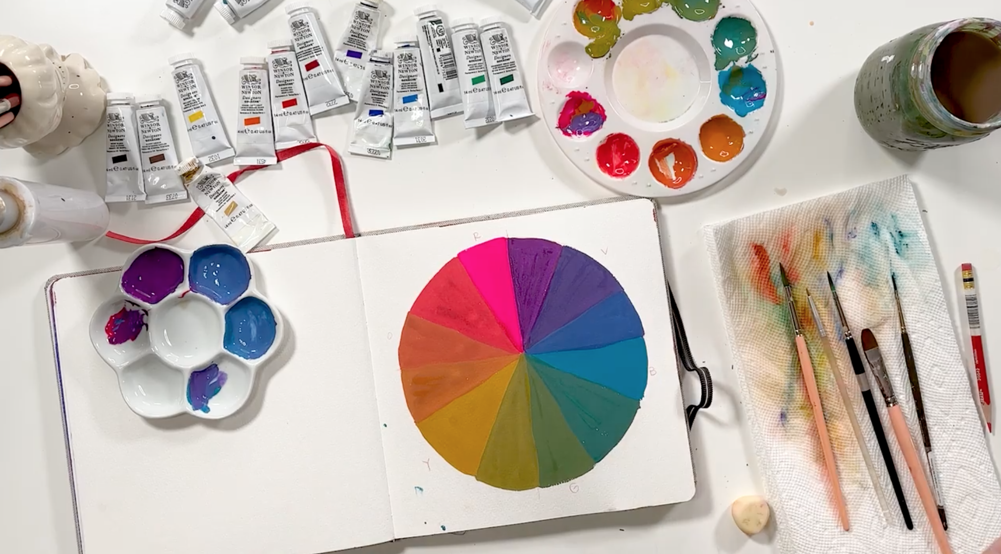
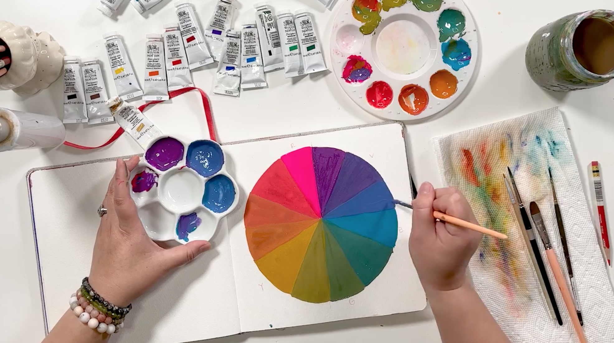
I’ll be using gouache in my example, but feel free to use any medium you like. Here’s an example of a nontraditional color wheel I created with yellow ochre, turquoise, and opera pink.
Choose your primary colors
You’re probably familiar with the standard color wheel. It looks like a typical rainbow of colors. But our goal is to explore a unique perspective on color by choosing colors that are within the primary color families, but not necessarily the standard primary colors.
Go to the art store (or your supply drawer!) and pull out colors that speak to you! Personally, I love turquoise in the blue family, yellow ochre in the yellow family, and magenta or opera pink in the red family!
The goal is to have fun and pick what makes you happy. This will help you discover color palettes that exhibit your taste. Playing with a different approach to the color wheel is a great way to discover your personal art style when you’re starting out. Feel free to repeat this color wheel exercise with as many different primary colors as you like. You’ll start to discover what you’re most drawn to and what feels unique to your creative spirit!
Sketch your color wheel
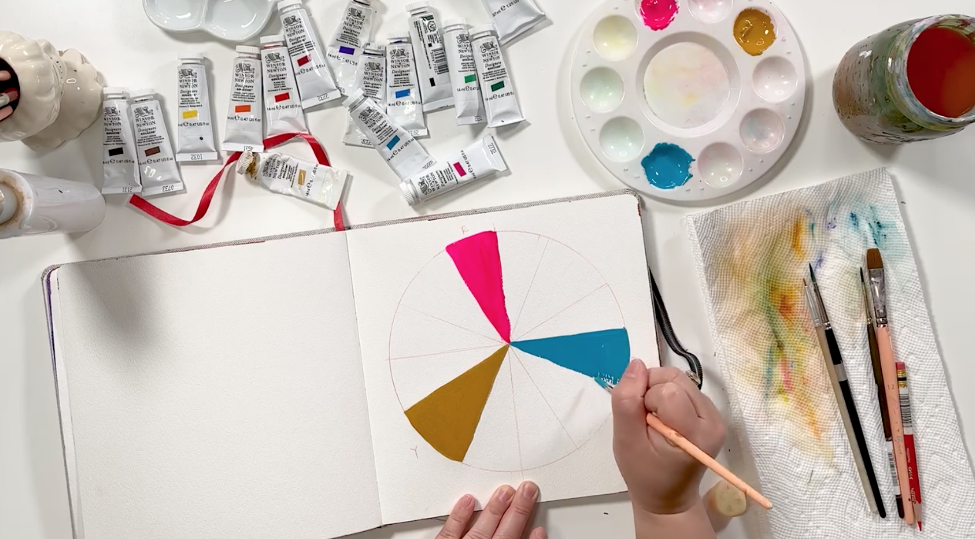
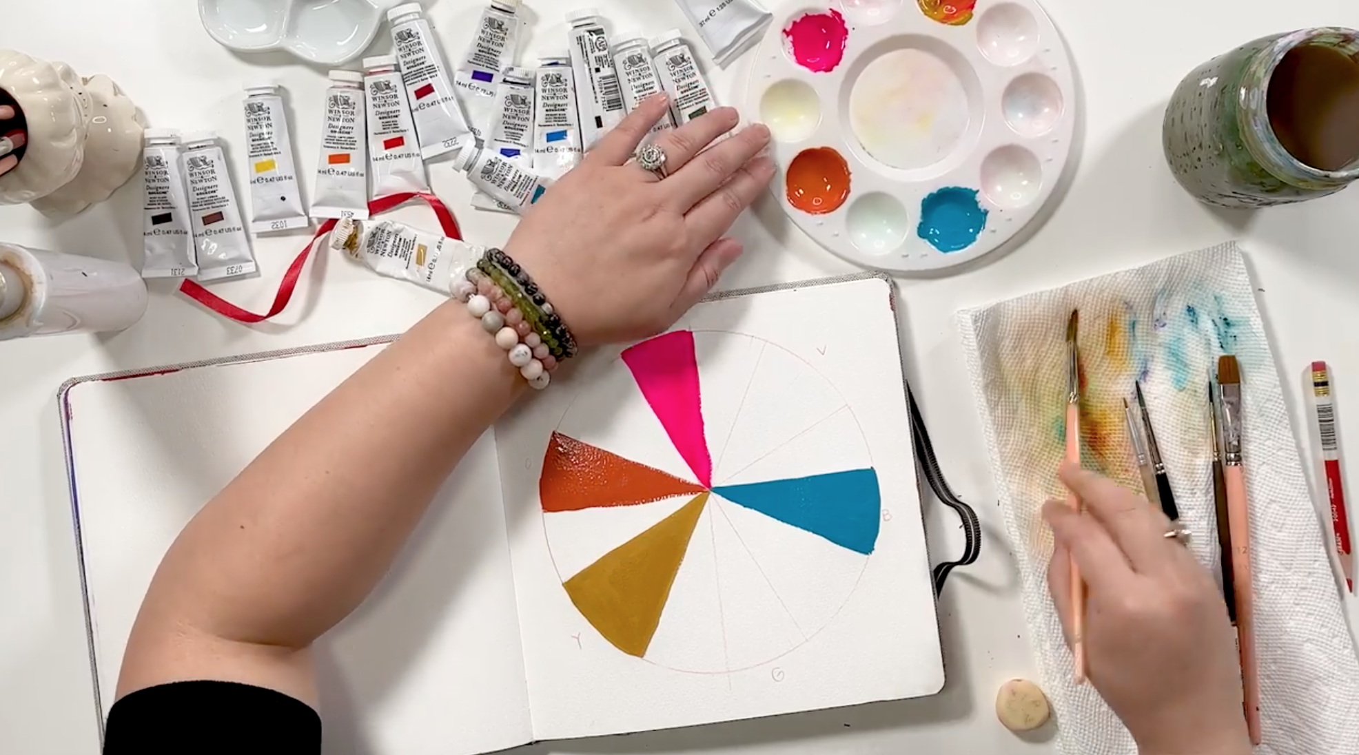
Next, it’s time to sketch the color wheel. Draw a circle in your sketchbook and divide it into twelve even pie pieces.

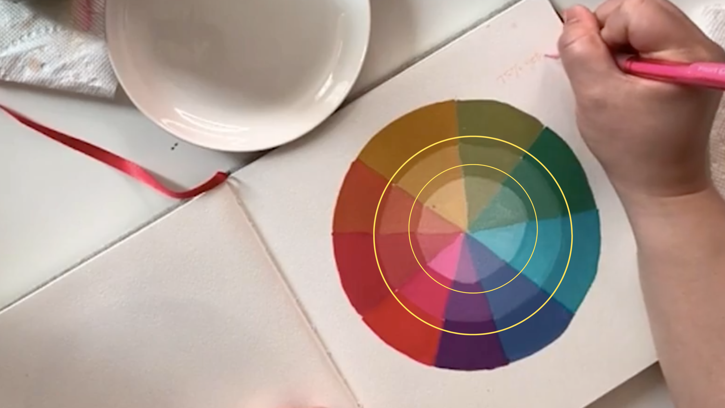
If you want to explore different values of each color, draw two smaller circles within your big one. This will allow you to paint two extra sections of your color wheel with lighter values of the same color like this.
Label your color wheel
It can be helpful to write down where each color goes on the color wheel so you have some guidance as you’re painting. Start by choosing a spot for your primary red. Then leave three blank spaces between it and label your primary yellow. Leave three blank spaces after the yellow and label a spot for the blue.

Paint the primary colors
I always start my color wheel by painting my primary colors. They’re the foundation of the color wheel, so having them in place will help you know where to place your other colors.
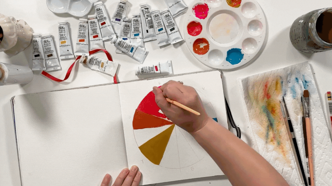
Paint the secondary colors
Secondary colors are a 50/50 mix of one primary color and its neighboring primary color. For example, green is the secondary color that results from mixing yellow and blue. You want to place the secondary color in the middle of the two primary colors on your color wheel leaving one blank space on either side of the secondary color.
Mix the two primaries together so that the mixture is a harmonious mix of the two. It doesn’t necessarily mean that you’ll use the exact same amount of paint for mixing these secondary colors. You just want it to visually appear to be a 50/50 mix. For example, when mixing blue and yellow, blue can overpower the more translucent yellow pretty easily. So start by mixing small amounts of the darker primary into the lighter one until you achieve the right balance.

Paint the tertiary colors
Tertiary colors are a combination of the secondary color and its neighboring primary. For example, the tertiary color between green and yellow will be yellow-green. To mix these, simply add more of the primary color to the secondary color so that it appears to be about 75% of the primary and 25% of the secondary. For example, the orange directly next to the red on your palette will lean more towards the red family. The orange next to the yellow will have a more yellow hue.
I recommend doing your tertiary colors right after you paint the secondary so your mixed paint stays fresh and you’re able to work within the same color family at the same time.
Repeat the process for the remaining primary colors
Now that you have the basics down, you can repeat the process for the remaining colors on your wheel!
Explore value
It can be helpful to explore the different values of a color on your color wheel. If you want to do this, start with the most saturated version of your primary color at the top, then add white in a 50/50 ratio for the middle piece, and end with a 75/25 ratio of white to your color in the center.

How to Choose a Color Palette
Use your color wheel
Your brand new color wheel is a great place to start when choosing the color palette of your next piece. I’m always surprised to see what hues result from using nontraditional primary colors!
Use color palette generators for inspiration
There are plenty of great places to find color inspiration online! I like using sites like cooolors.co to generate color palettes and gather inspiration when I’m in a color slump. They have a random color generator and a page full of trending color palettes as well!
Start with a standard color scheme
A tried and true way to create a harmonious color palette is to use a standard color scheme. This topic deserves its own blog post, so I won’t go into it all here, but a few color schemes to try are analogous (colors that neighbor each other on the color wheel), complementary (colors across from each other on the color wheel), and monochrome (using different values of one color).
I go into much more detail about these different color schemes (and introduce even more of them!) in my class, Introduction to Color Theory. This class is a deep dive into the world of color using gouache. It’s a fun and hands-on way to explore color where you’ll learn how to explore different color palettes by painting beautiful butterfly pieces!
